Pages

Friday, April 26, 2013

Road Trip Ruminations

Road trips.  An opportunity to expand your horizons.  To be bold and adventurous and see what you can discover.

It all started with this musical being on the Bucket List for Teenaged Daughter and me.  Last chance to see it was in NYC last fall, and we decided on Mamma Mia instead.  So fun!  Then earlier this year, some internet browsing revealed that the Broadway tour of Wicked was coming to Rochester around the time we both have our birthdays.  Rochester…who knew?  Let’s get tickets and figure out the details later.  That’s how it works around here.  Road trip, here we come!
Along came the big weekend, and we had this poignant moment at the border.
IMGP6581_rochester_007
Tragic events in Boston during the week made this border crossing a long and sombre one.
Once we were across and Teenaged Daughter had navigated us through a pit stop and into the right direction she quickly got bored and took hold of the camera.  Along with some crazy Selfies, she took this fantastic shot.
IMGP6591_rochester_011
Ah, the open road.  Discovery and inspiration await us, and there is a feeling of solidarity as we navigate it together.
First stop, Wicked.  Fantastic.  If you haven’t yet seen it you must make an effort.  If you have, what was your favourite thing about it?  The costumes from the Emerald City were spectacular.  Check out some of the hats and gowns.
The story is a great exploration of finding your own path in life, and a tribute to real friendships.  Best line from a song…Because I knew you I’ve been changed For Good.  True words.
The next day, a walk around the neighbourhood of the theatre and our hotel was like this.
IMGP6597_rochester_003
I wonder how my life would be more creative if I lived in a blue house?
And many more opportunities to take pretty pictures…can’t go wrong with an old tree, weathered fence and wildflowers.
IMGP6644_rochester_006
A happy discovery…Rochester is home to the Eastman House!  George Eastman was the founder of Kodak and modern photography, and generous patron to the arts and sciences.  We made a visit to his historical home.
Now this is a civilized way to start and end your day.  So exquisite and beautiful.
IMGP6634_rochester_005
Can you imagine having a conservatory like this in which to soak in the light…the space…the view…the elephant head?
IMGP6616_rochester_004
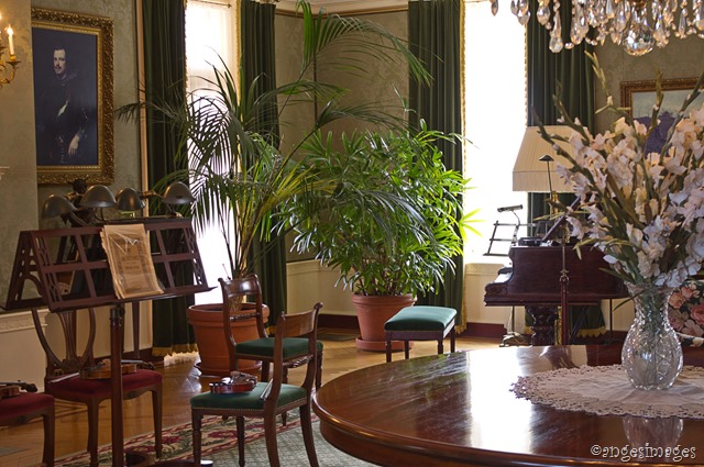
And check out this library.  Music, writing, books, art, light, fireplace…all my favourite things.  I could live in a room like this.  Couldn’t you?
IMGP6627_rochester_010
Ah yes, a good road trip.  We’ve expanded our horizons and deepened our relationship.  Happy Birthday, Teenaged Daughter.  What’s next on the Bucket List?
I leave the rest of you with some decorating inspiration.
IMGP6631_rochester_008
Be bold.  Expand your horizons.

Tuesday, April 9, 2013

Lighting on a Budget

IMGP6502_lighting tutorial_08
According to Kimberley Seldon, who is a brilliant decorator and equally great teacher, the number one thing that makes an interior look dated is the lighting.  Yikes!  Harsh words to those of us on a decorating budget.  Or who have better things to spend their money on like vacations and shoes.  Lighting can be Really Expensive. 
So my biggest lesson when shopping for lighting is this.  The priorities are function and form, probably in that order.  Shop diligently for something that will meet your lighting requirements.  What size is it?  How bright is it?  Is it hard-wired?  Is it adjustable?  And shop for something that is classic and transitional in form.  It will see you through many more years without looking dated.
What NOT to worry about:  the shade and the finish.  Every big box and discount department store sells shades and these can be easily switched out.  Some of my favourite sources are Wal-Mart, Canadian Tire and Homesense.  And the finish…also easily changed.
So let’s learn from some new lighting that came into the master bedroom recently.
IMGP6366_lighting tutorial_06
These are the bedside lamps, found at Sears online for less than $80.  Also there was a deal if you bought two.  Score.  So the function was perfect.  A wall sconce which could be plugged into an existing outlet.  No re-wiring required, and I need all the room I can get on my bedside table.  I tidied it up for the photo but in real life it is piled with books, magazines, creams, lotions, beverages, food, books, and did I say magazines?
IMGP6365_lighting tutorial_05
Also it has an adjustable arm and three levels of brightness.  Perfect.  The finish however is kind of weird.  A pinkish sort of brushed metal that I don’t really understand. 
For the ceiling fixture I was looking for a simple pendant with a drum shade, a very short stem so it would sit close to the ceiling, and a diffuser across the bottom so we weren’t looking up into a light bulb.
IMGP6369_lighting tutorial_07
You’ll never guess where I found it…Wal-Mart!  Actually!  Less than $30!  So again it’s perfect, except for the finish which looks pretty cheap.  (Well, I guess it is.)  And once you’re at this point, your best friend is a can of spray paint.  For this project I went with the advice of the always-genius Nate Berkus.  If you ever watched his show when it was on, you know he was a big promoter of spray paint for updating or co-ordinating your decor.  But who knew you could get it in an oil rubbed bronze?  Well, Nate, of course.  Oil-rubbed bronze is a great finish for a classic, timeless look.
IMGP6498_lighting tutorial_04
So this is the product I used.  Since I was impatient waiting for the weather to warm up to paint outside,  I painted down in the basement.  (Well, technically Husband did.)  When the instructions say Well Ventilated Area they are not kidding.  Open up every window in your entire house.
And here is the fabulous, finished, co-ordinated result:
IMGP6496_lighting tutorial_03
You can see in this close-up how it has the great sheen and texture of a real oil-rubbed bronze finish.

IMGP6495_lighting tutorial_01
I’m in love with the results.  Just the upgrade I was hoping to achieve in our master bedroom.
IMGP6502_lighting tutorial_08
So now, Kimberley Seldon, at least it’s not the lighting that makes this room look dated.

Wednesday, April 3, 2013

Easter Bits and Pieces

IMGP6490_easter_011
So Easter has come and gone for another year.  There were lots of fun traditions that we managed to fit in.  The combination of family time, good food and some candy of course made for a memorable holiday.  Easter lilies are such a beautiful symbol of the season.

IMGP6463_easter_005
I also managed to defrost the outdoor urns enough to replace the evergreen and dogwood branches with some pussywillows and my crocuses from inside.  The blooms are spent but the foliage is so delicate and pretty.

IMGP6412_easter_006
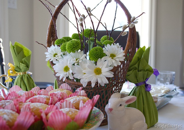
On Good Friday my Family came for lunch.  Here you can see part of the tablescape at dessert time.
 
It’s also tradition for us to colour eggs on the Friday or Saturday before Easter.  The kids all insist on participating every year, which I love, and it’s a lot of fun.

IMGP6446_easter_010
These saturated-colour eggs we do every year.  I make up several glass bowls of different colours, deep enough to submerge at least a couple of eggs at a time.  The colour recipe:  boiling water, a big splash of white vinegar, and a dab of this icing colour paste.
 
IMGP6424_easter_007 IMGP6435_easter_009
Covering different parts of the egg with elastic bands, stickers or crayon between colouring it in several different colours makes the cool designs you see above.

IMGP6445_easter_008
This year I tried a new idea from Pinterest.  Brown eggs decorated with a white paint marker.  All the kids were into it and they turned out really pretty!

IMGP6468_easter_001
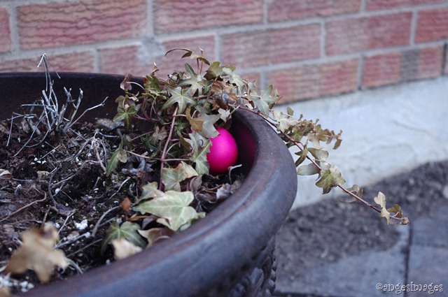
Magically the Easter Bunny shows up during the night, steals the eggs from the fridge and hides them in the backyard.  Super-fun!  Every year on Easter morning.

IMGP6474_easter_002
Do you think he’ll find it?  He’s pretty tricky, that Easter Bunny!